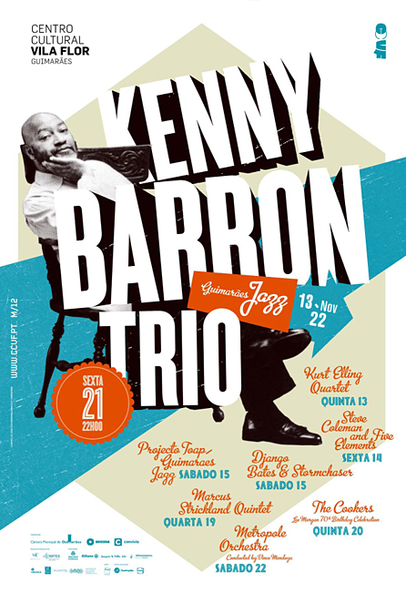
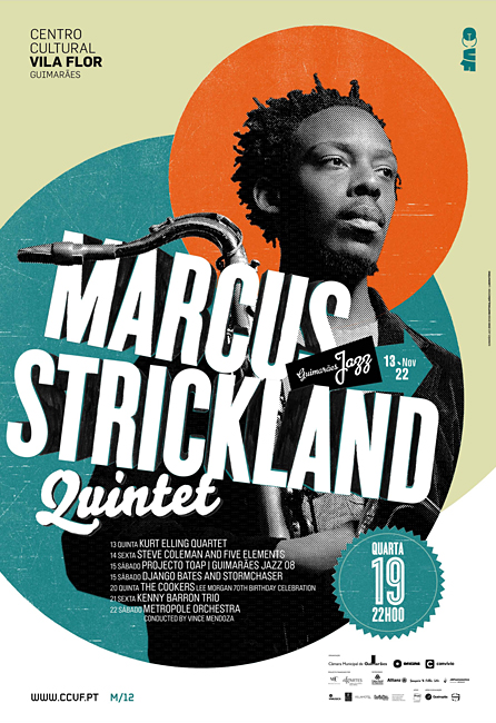
Maximum Missions was heading to Peru and needed a new brochure/poster for their mission trip. When I started planning the brochure, I wanted it to be something graphically fun, but still convey all the necessary information. So, with that, I started searching for inspiration.
I found a ton of design ideas that I liked, but here are a couple of the designs that really played a part in the final design of the brochure.

 For the two images, I really liked the color scheme and the typography. You will see how they added to my finished product. I had a few ideas when brainstorming for the overall design.
- Flat world map, maybe pixelated, blue/yellow/orange, focus on country inside.
- Folder – mission documents, logo stamp on the front like “confidential.”
- Old map, burned edges, old compass, treasure map style.
- Retro colors with some cool typography (think 60s, 70s, 80s for color).
- Old manual, retro, bright colors.
With that, I made a couple of mock designs. The first one was a more vintage/historic concept and the other of the retro manual idea.

The final decision was to go with the historical, grungy design with a mixture of some of the ideas above. Below are my notes and plans for the final design.


I also had a couple of variations of the text on the pages, as well as, a few design decisions.


I was really happy with how the final design came together. After a few picture changes, some resizing and some text changes it was complete. And now for your viewing pleasure…
(drum roll)
the final design!


